

Understanding your brand is vital, but knowing how to speak to customers in your unique voice is the real challenge.
“Know thyself.”
It's vital to start by looking inward. What do we know for certain? Where is the company heading? What are our customers saying? What do we value as a company? What don't we value?
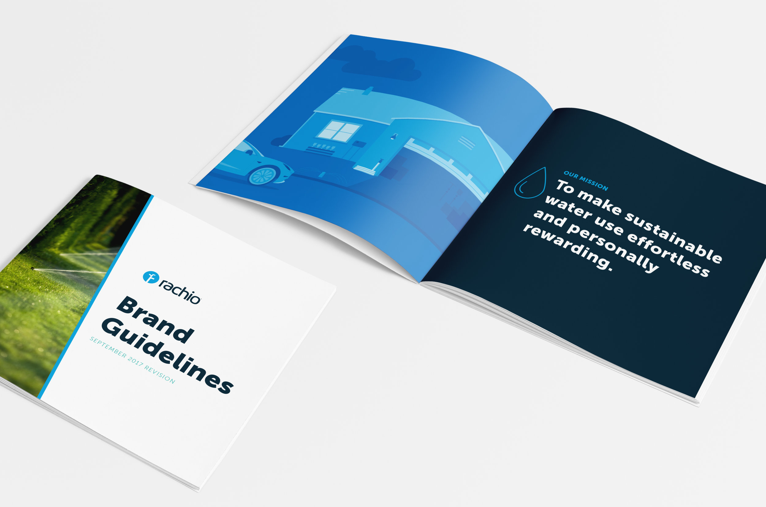
By starting with understanding and articulating your company's mission and values, you build on the strongest foundation.

Find your voice.
Once you have a solid foundation, you can start identifying the pillars that will support your messaging and design. This is where a kick ass copywriter comes in handy. I had the privilege of working with Jenny Clawson on this project.
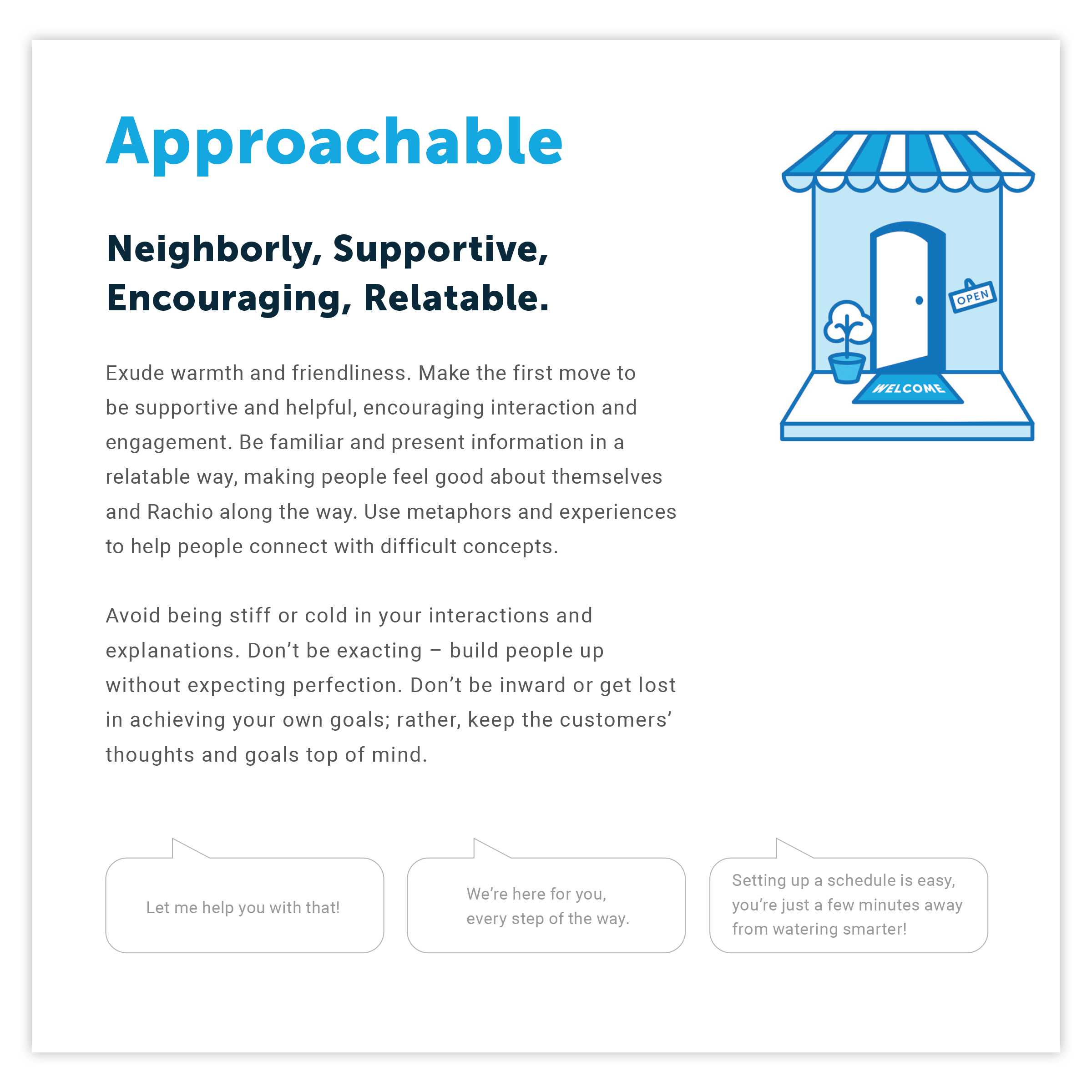
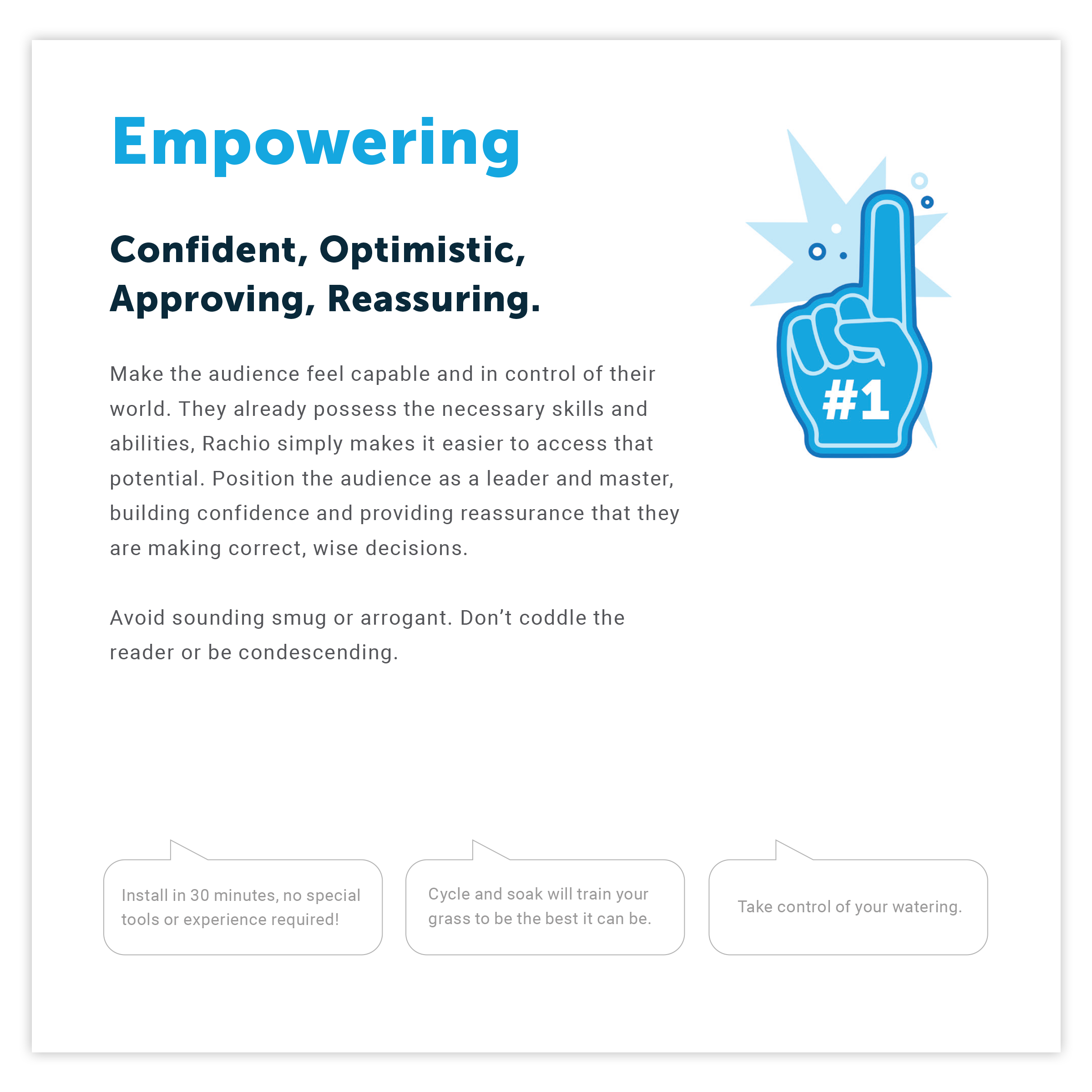
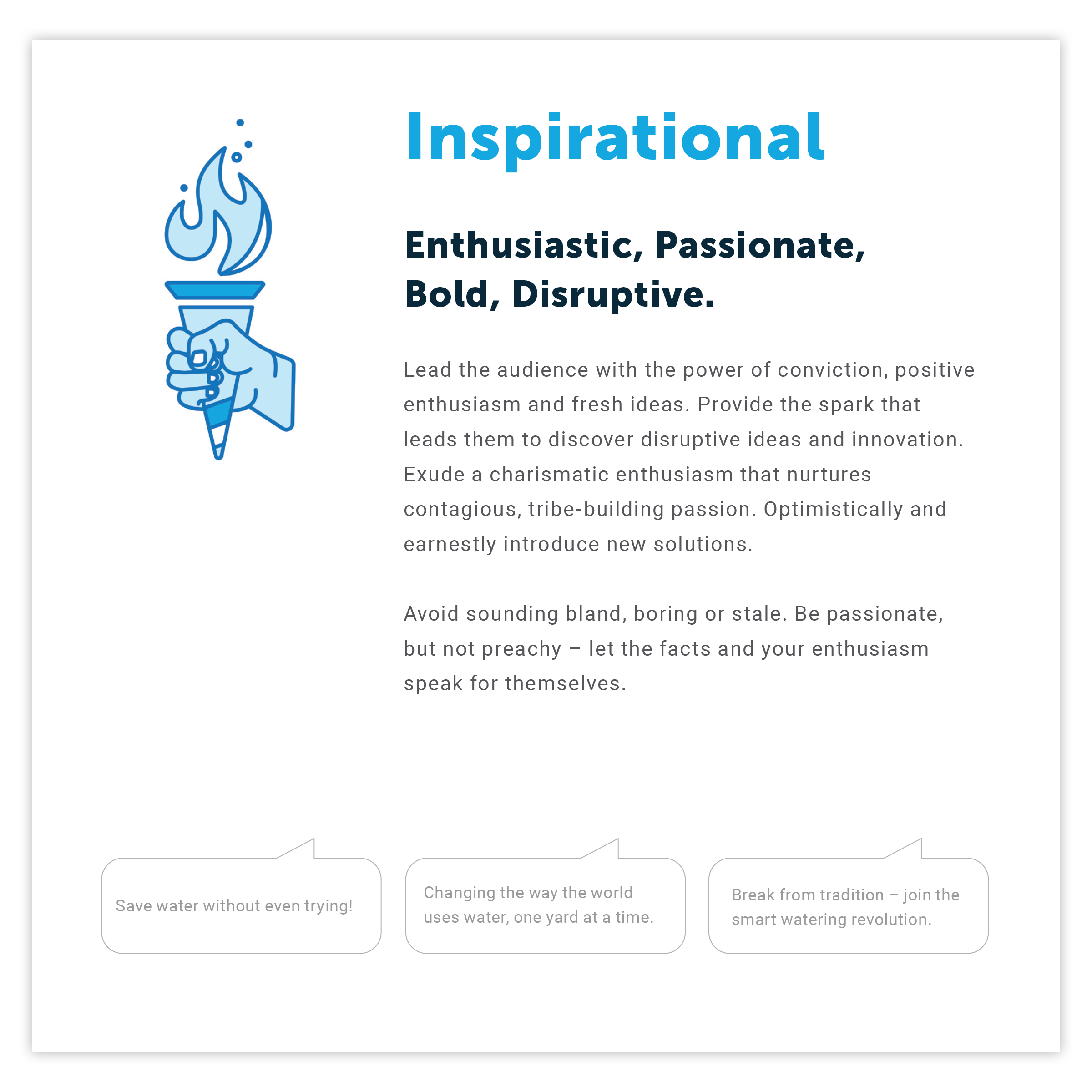
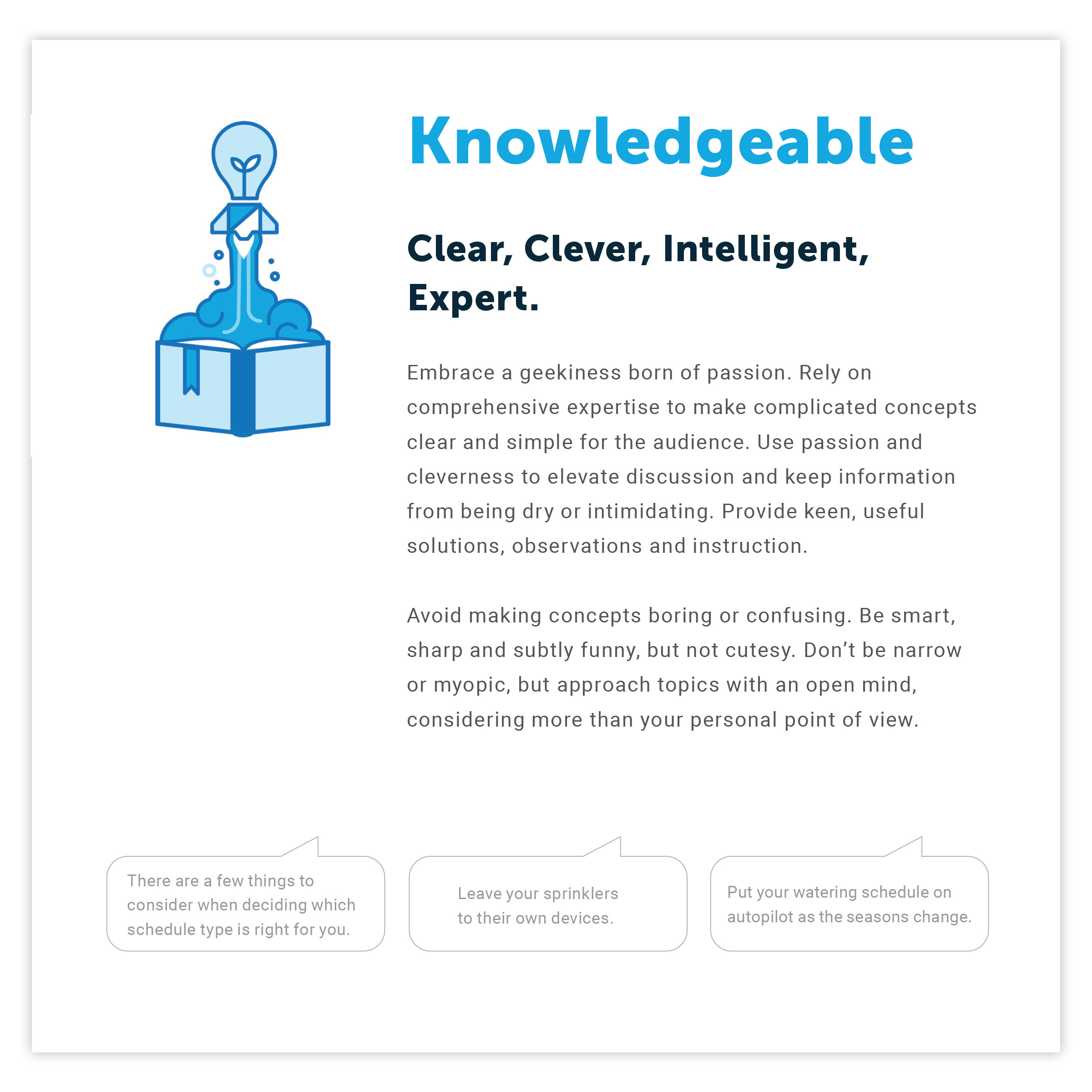
At Rachio, we needed a voice that was strong and empowering but still approachable. We needed to be informative but not boring. Rachio is founded on software in a market filled with old fashioned hardware solutions. We needed to show that we were different and innovative, but without being cliche.
Set some standards.
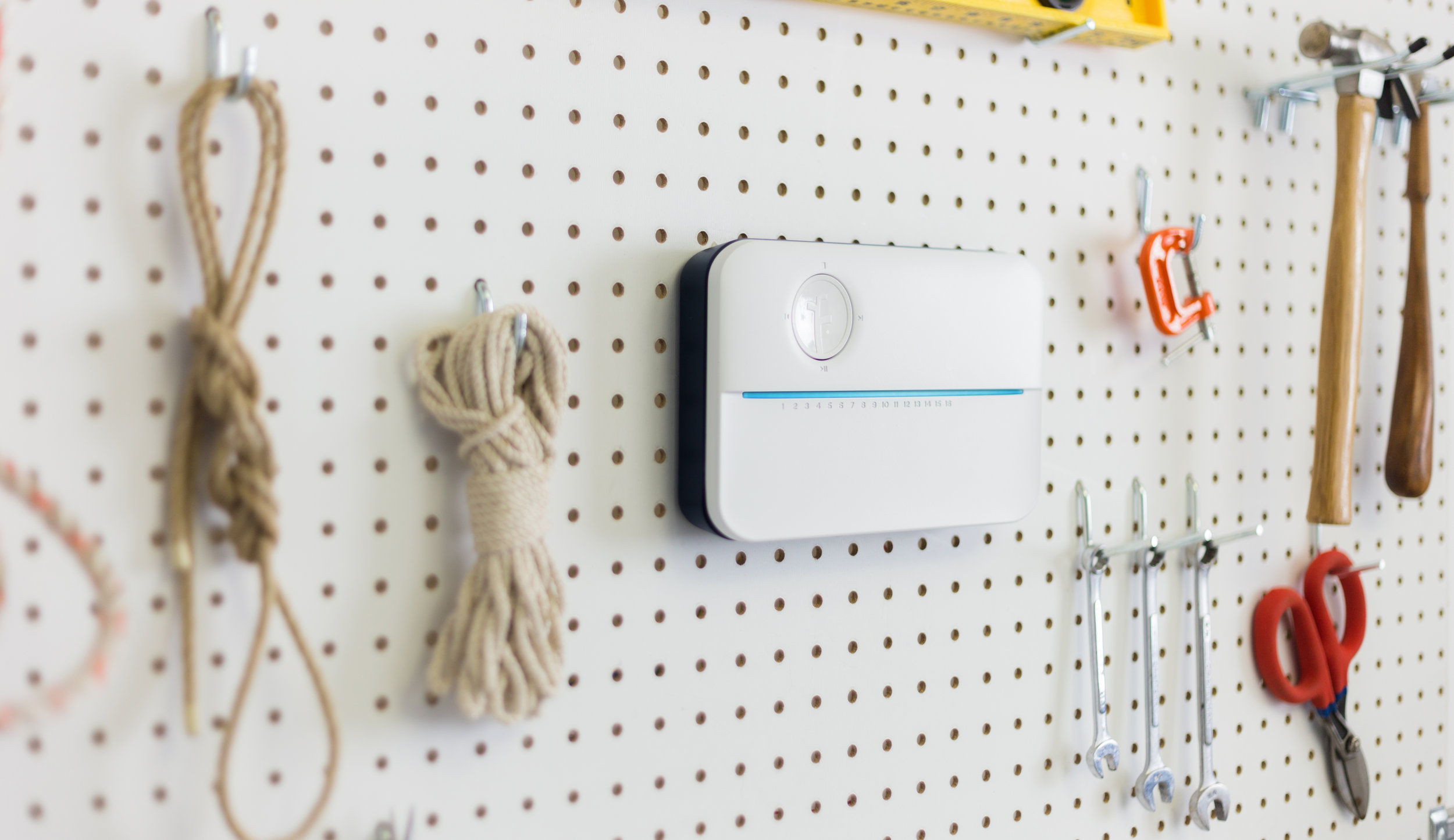
When I came to Rachio, they had yet to establish a single logo for their product. Treatment of the logo varied from month to month, from medium to medium. That is a recipe for bad brand recognition.
One of the first things I did was refine the logo and establish some straightforward guidelines. This meant the logo was treated correctly in every context.
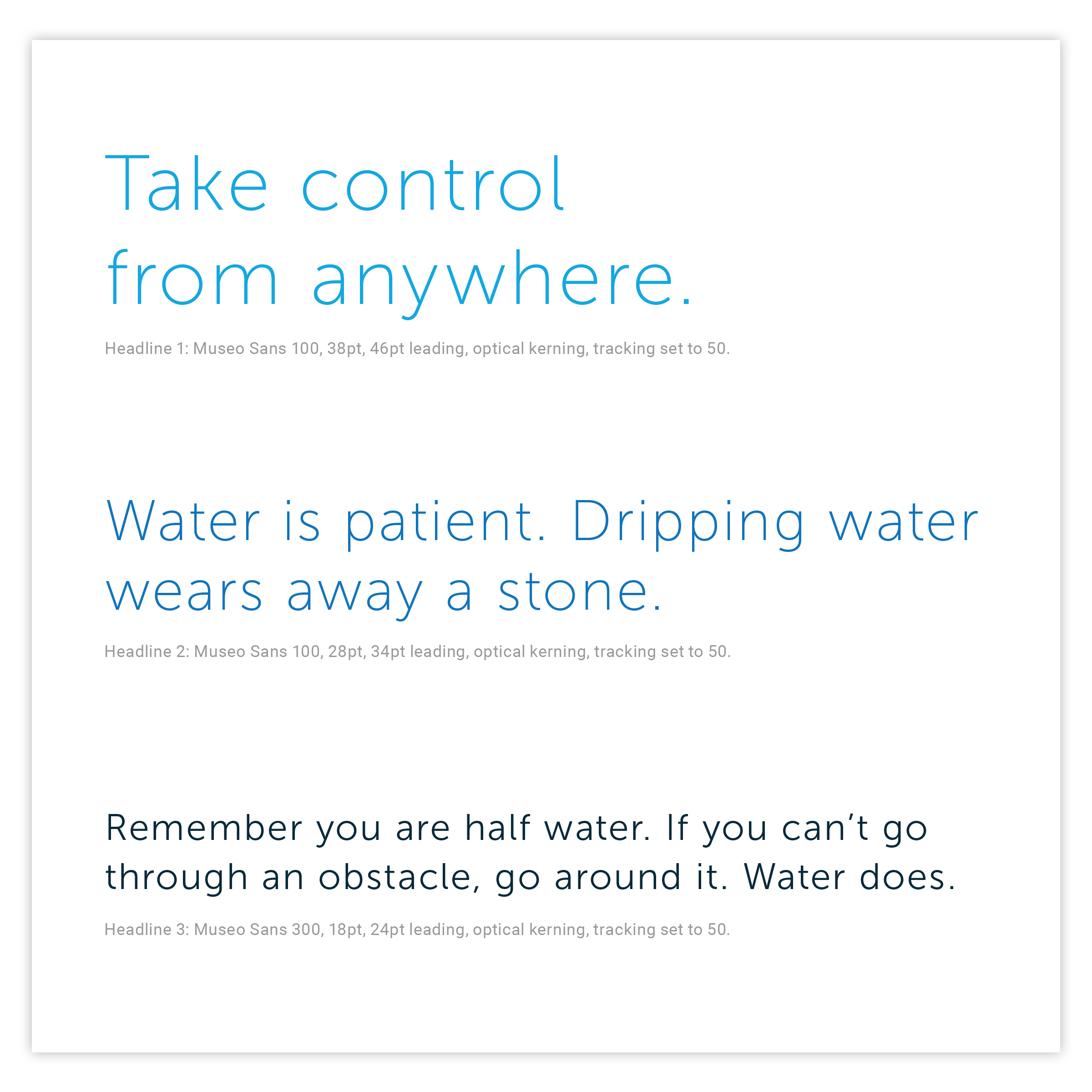
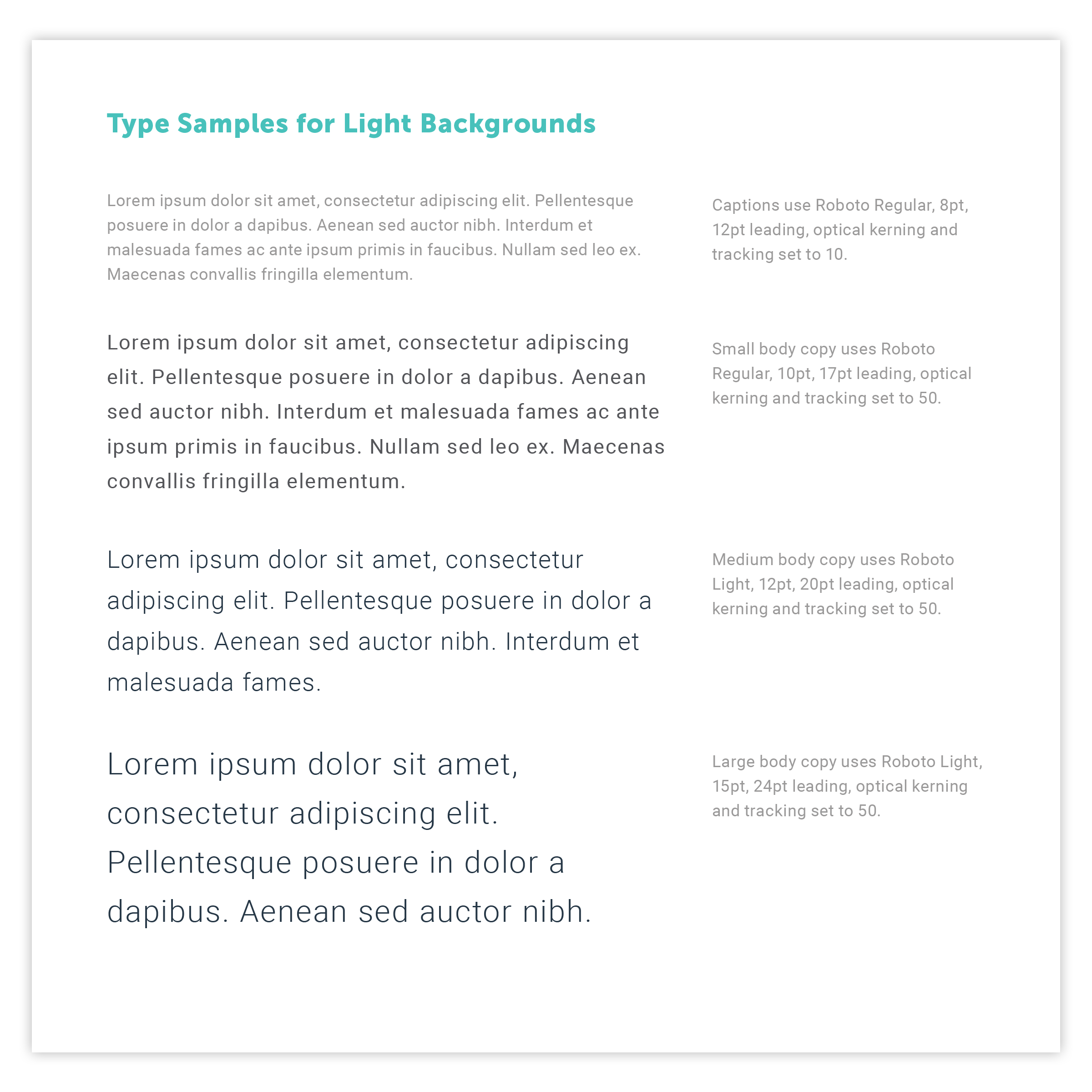
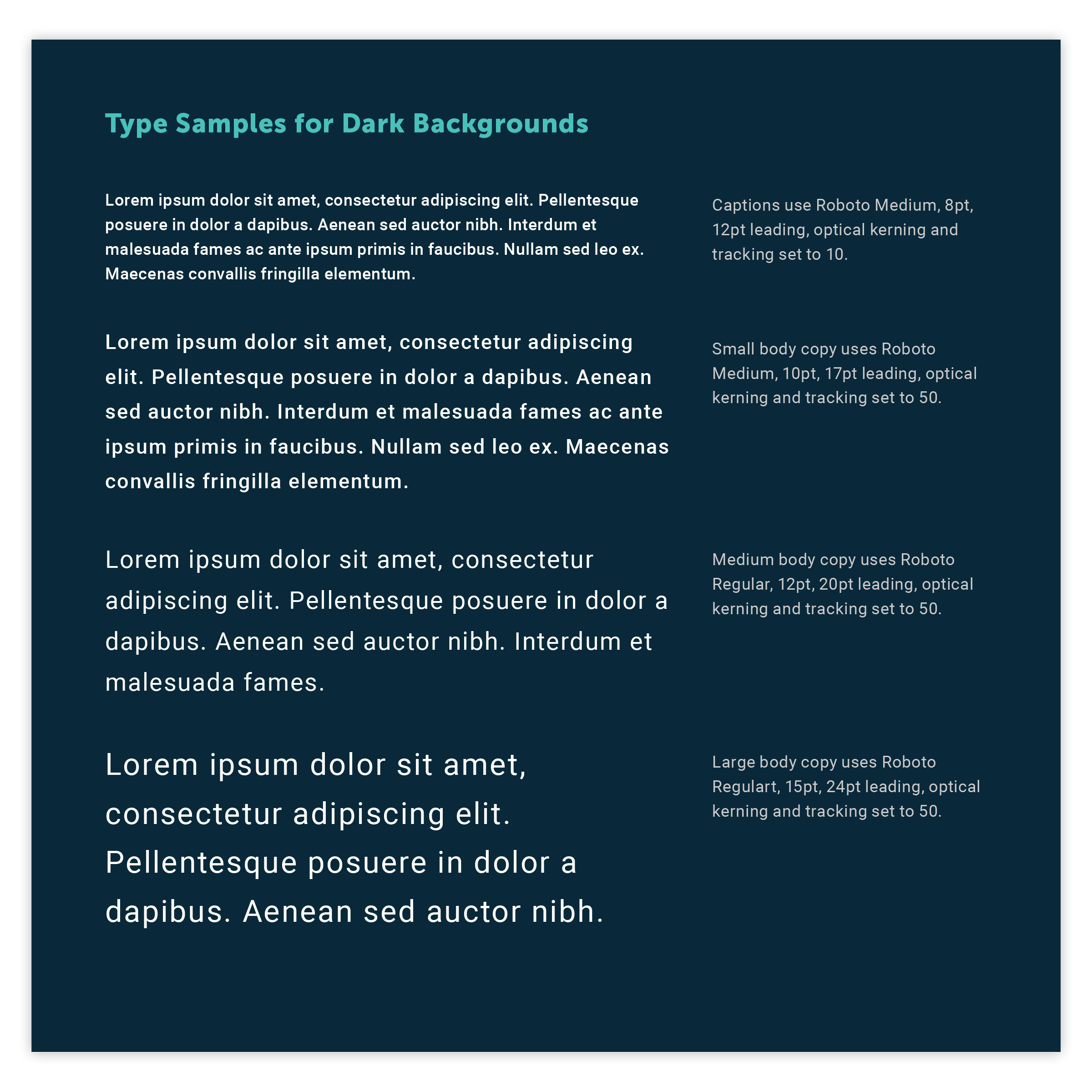
Typography matters.
Some of the smallest things can wind up being more important than you ever expected. When you set a standard for something like typography, you can save thousands of hours down the line. No kidding.
Consider the difficulties of fonts changing or breaking layouts in different versions of an app or website. Think about the potential cost of having dozens of off-brand treatments printed and shipped.
Setting the right standards saves time and makes your brand stand out.
Iconography
Rachio's icons are simple, easy to interpret and a little bit fun. In the app and within our marketing materials, all icons should be used consistently.

Illustration
Rachio's illustrations are clean and sharp. They are often monochromatic, although accent colors can be added sparingly. Rachio is a technology leader in the IoT space, and all imagery should reflect that.
These illustrations should not feel soft or childlike, so think carefully about color and form.
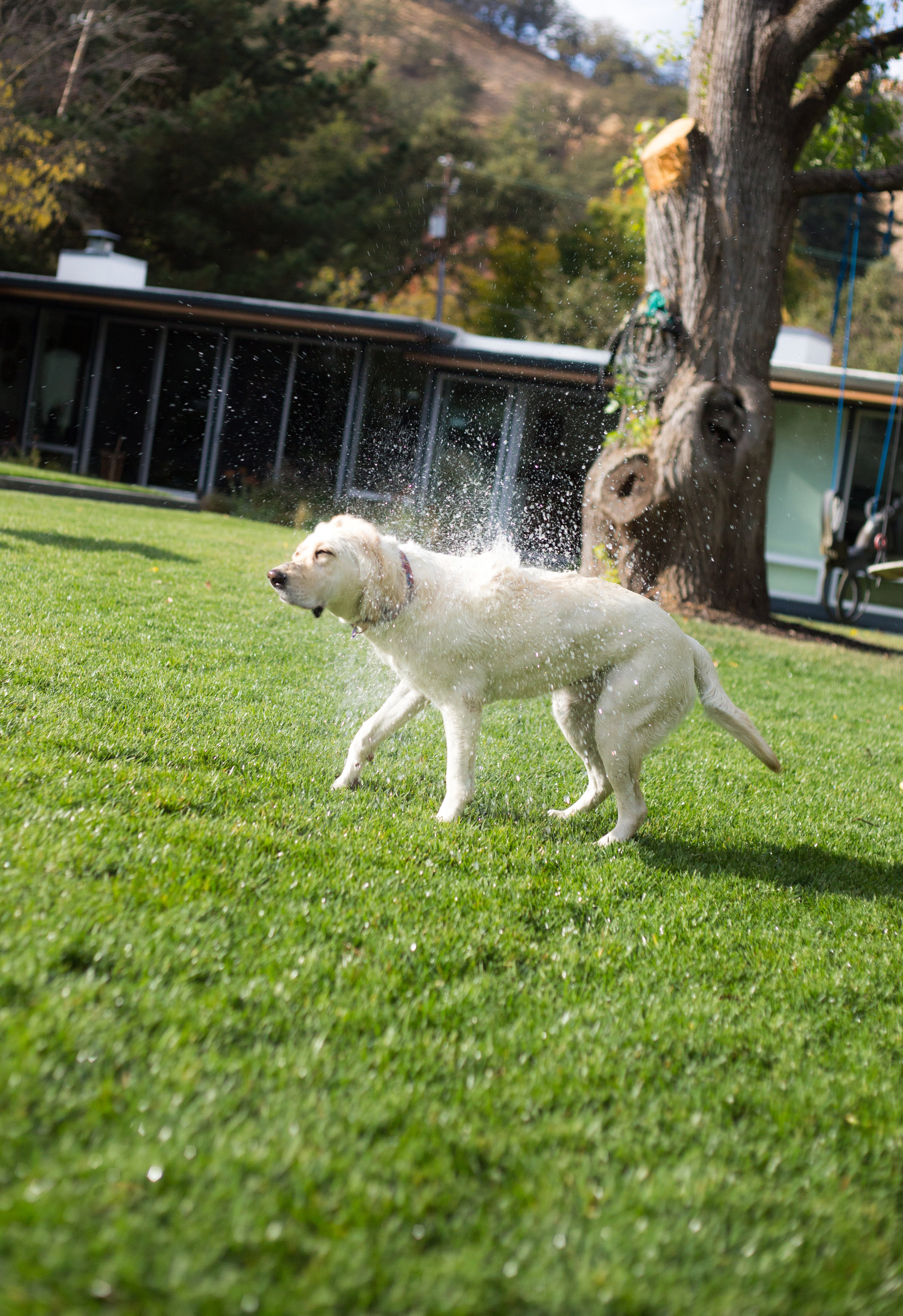
Rachio’s photography is contemporary, real and lifestyle-focused. Photos should feel true to life, not staged. Choose imagery that is rich and full of color. The photos should focus on the experience of Rachio; how it makes you feel, the experiences it provides and the beautiful yard it helps to create. Consider whether photos show responsible watering. Soaked sidewalks and muddy puddles are not what Rachio is about.
These photos were shot in collaboration with the studio Near Future. Credit for the kick ass photography goes to Pavel Fedorov.